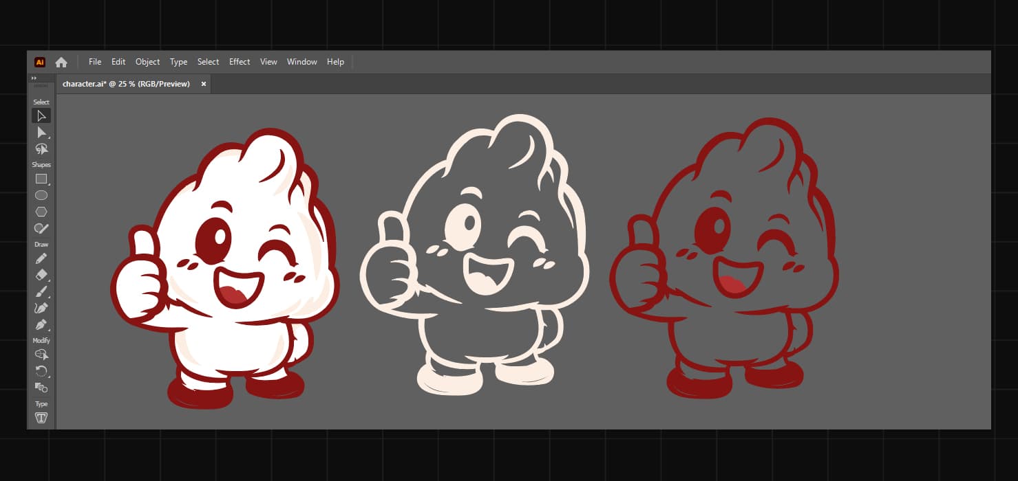
HI.WONTON - BOOTH BANNER PROJECT
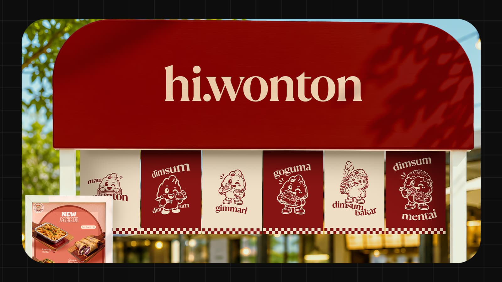
Hi.Wonton Dimsum Booth Branding - A comprehensive banner system for food events featuring serif typography, playful vector characters with distinct personalities, and alternating red-cream color scheme. Includes top/bottom booth signage with tagline "Warm Bites, Happy Days" and Instagram handle @hi.wonton, plus hanging banner set showcasing dimsum menu varieties (dimsum bakar, gimmari, mau wonton, dimsum mentai) with character-driven individual card designs created in Adobe Illustrator and finalized in Photoshop. Simple, clean aesthetic maximizing event visibility and customer engagement.
Tools
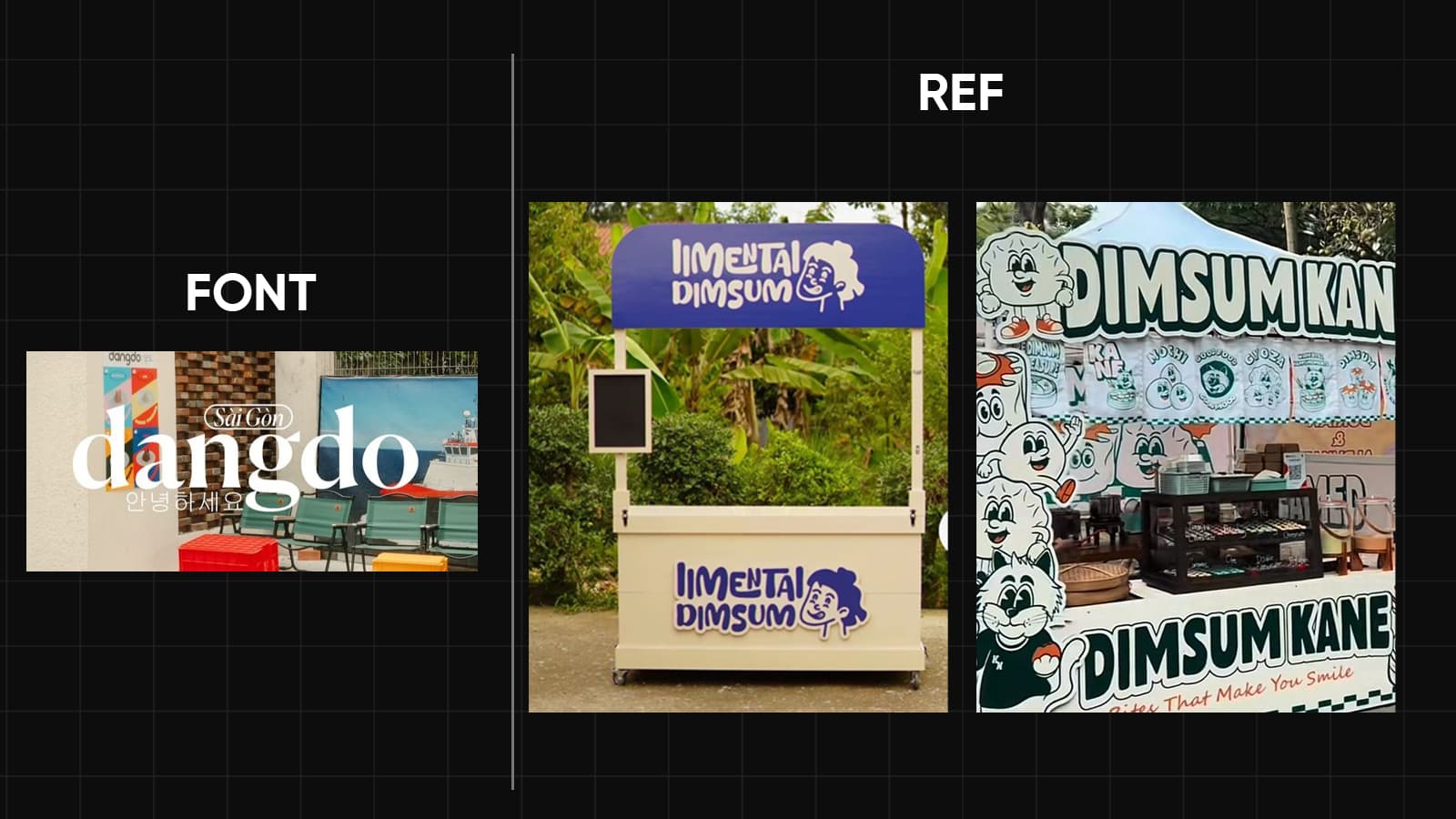
Hi.Wonton required a cohesive booth branding system for food events selling various types of dimsum. The design challenge was to create simple, memorable banners that communicate the dimsum variety without visual clutter. Solution utilized serif typography for premium aesthetic, playful vector characters inspired by reference designs showing distinct personality and style variations, minimal decorative elements maintaining clean visual hierarchy, and red and cream color palette establishing strong brand consistency. Character-driven approach with Indonesian dimsum menu names (dimsum mentai, gimmari, dimsum bakar, mau wonton) creates engaging, culturally relevant branding while serif typography conveys quality and tradition.
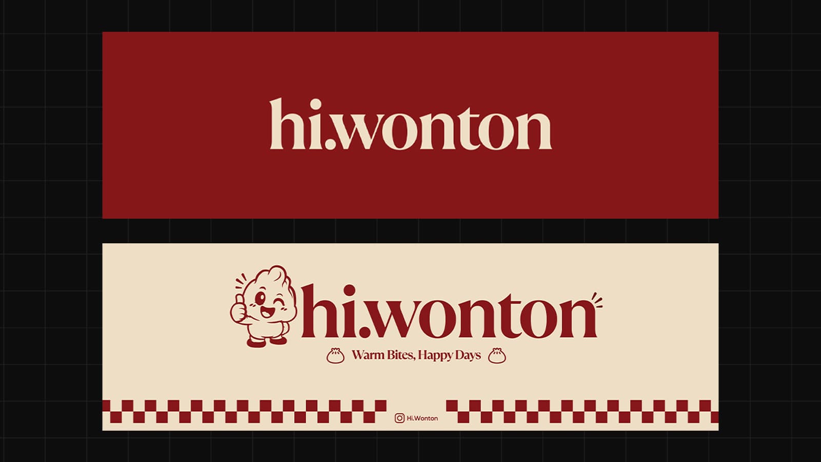
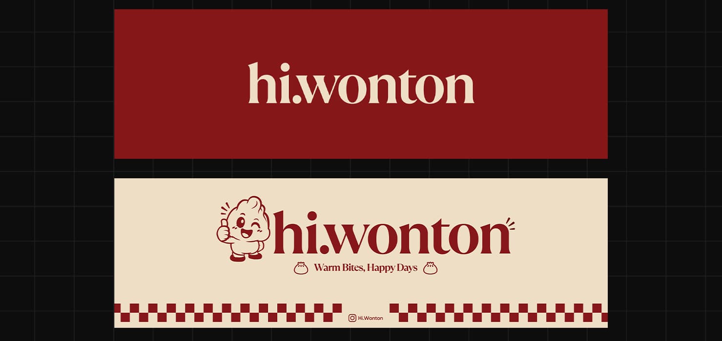
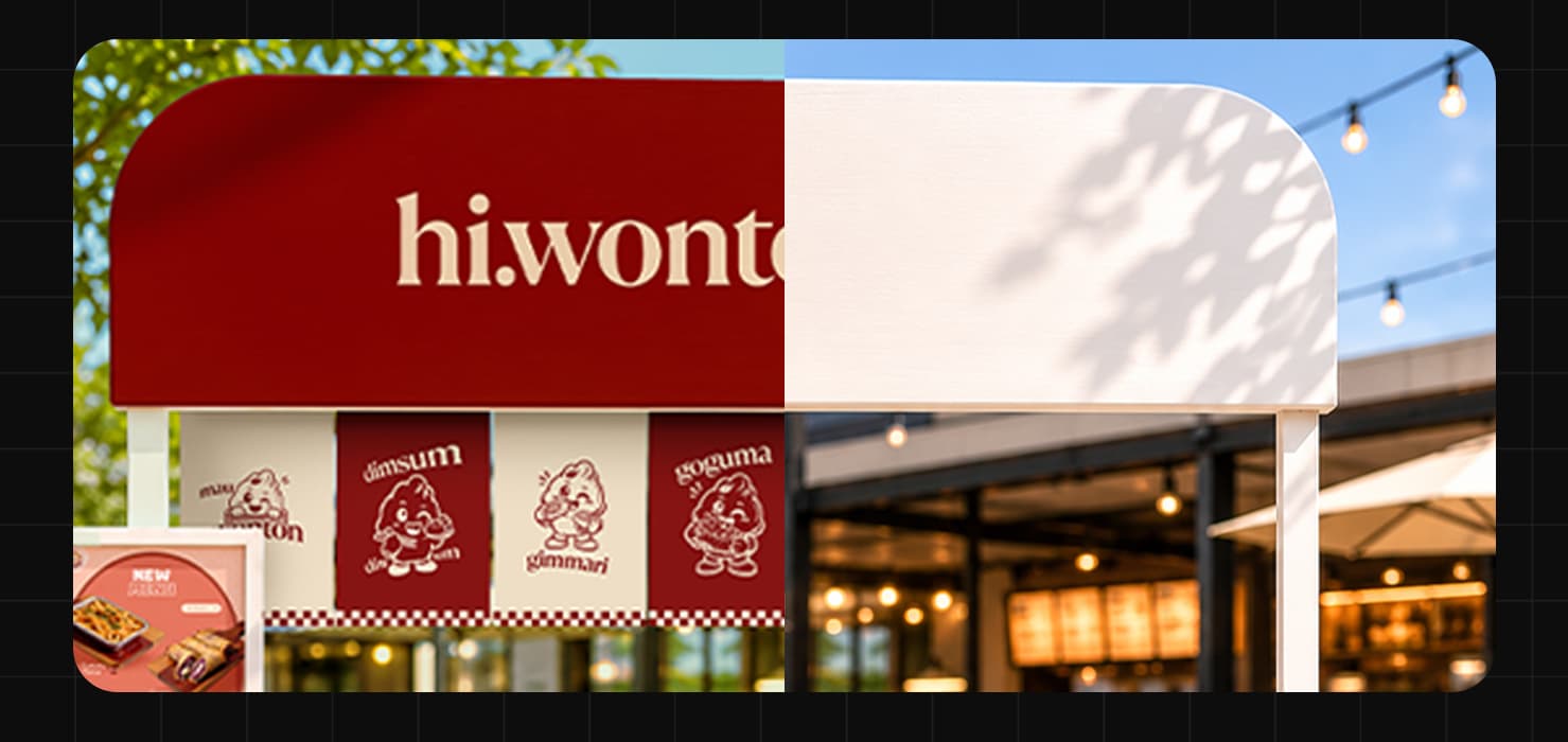
The booth banner system consists of top and bottom signage for maximum visibility. The top banner features clean serif typography spelling "hi.wonton" without additional decoration, creating premium, minimalist aesthetic that catches attention from distance. The bottom banner combines serif typography with playful vector character illustration, tagline "Warm Bites, Happy Days" and Instagram handle @hi.wonton for customer engagement, red and cream checkerboard border pattern maintaining consistent brand identity. Simple composition with clear hierarchy ensures readability at event distances while character inclusion adds personality and approachability. The dual-banner approach creates complete booth branding that communicates both professionalism and fun, encouraging customer interaction and social media follow-through.
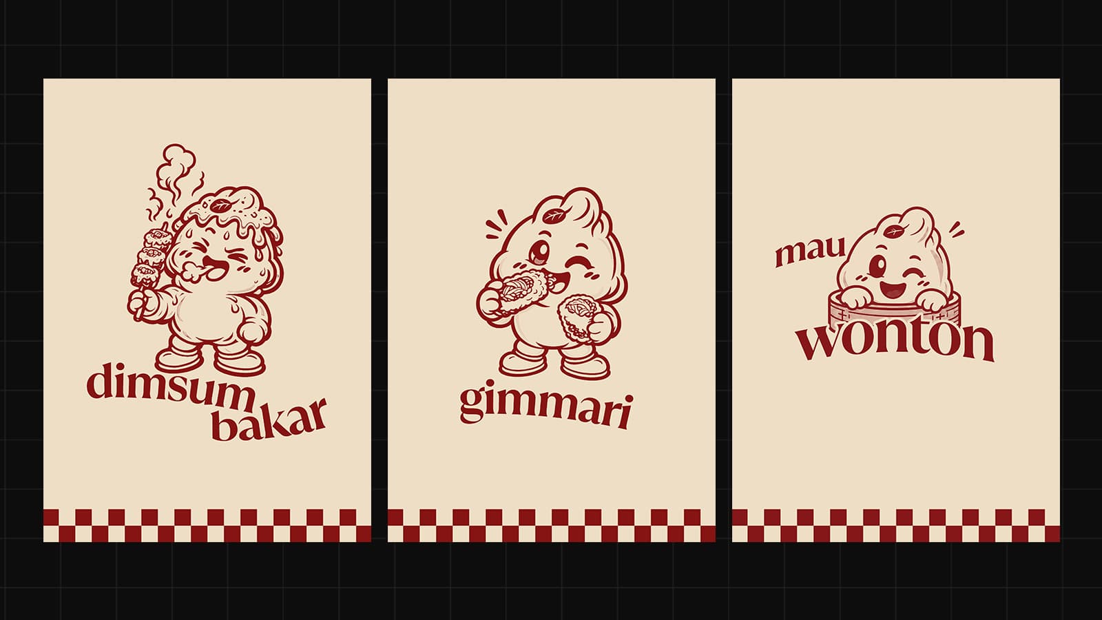
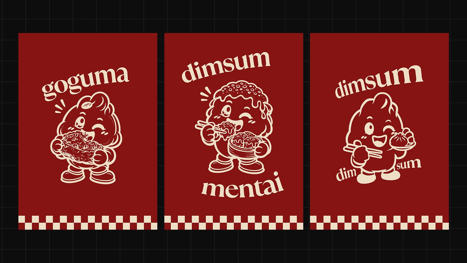
The hanging banner system features three distinct character-driven designs, each with unique vector illustration style and personality. Individual cards display different dimsum offerings: "dimsum bakar" with one character style, "gimmari" with contrasting character expression, and "mau wonton" with varied artistic approach—creating visual diversity while maintaining cohesive brand identity through consistent serif typography and red color palette. Alternating cream and red backgrounds create striking visual rhythm when displayed as hanging horden at events, maximizing visual impact and menu variety communication. Minimal decorative elements (only checkerboard borders) keep focus on character personality and menu names, ensuring clarity at booth distances while engaging customers with varied character expressions and dimsum varieties.